
When Violet Volt and T.E.A.M. Wicked were released, I didn't really bat an eyelash. I like Urban Decay and Kat Von D is one of my favorites. Too Faced released their Life's a Festival collection which is inspired by unicorns, and the style out there right now is that the more colorful and out there the colors are, the better. And the lip shades that are on the market in SeneGence's price point are what is in style right now. While it's not for everyone, it does seem that this is the style. Too Faced has released Mermaid Tears which is a mermaid sea-green with hints of purple sparkle that shade-shifts depending on your temperature. Urban Decay has Control, their vivid electric blue turquoise lipstick that is bound to turn heads. Kat Von D has Echo, a satin navy blue liquid lipstick. And yes. People are wearing them! I was at Specs a few weeks ago and the cashier checking me out was wearing royal blue lipstick....and she looked GOOD wearing it too!
So...kudos to SeneGence for coming up with colors in keeping with the other prestige cosmetics. I don't know how often I would want to wear a bright turquoise LipSense, but darn it, if I do, it's a relief to know it won't be smearing all over my teeth and face.
And as for these bright colors? Hey. Go big or go home. Do it right or don't do it at all.
Yesterday my new colors finally arrived, and since I have two readers who want to see me wearing each color before they will decide if they want them, I decided a full review of every color is in order. And honestly, I have to admit I'm curious as to what I will look like wearing matte turquoise. I've been brave and worn Violet Volt, Blackberry and T.E.A.M. Wicked, but turquoise lip color? Yup, I'm VERRRRRRRY curious.
So, in this post, I will review all five colors and swatch what each one looks like in comparison to the closest contenders. Over the last week, there has been a lot of rumors circulating about true swatches, whether or not pictures are photoshopped, what they really look like. Are these colors really dupes of Volt and Wicked? Is Mod Magenta really the current version of Neutral? Want to find out before you spend your money on a color that you don't like? Keep reading, and let's begin.
To start, whenever I swatch colors, I always start from lightest to dark. And in keeping with the matte fashion, I am wearing each color WITH Matte Gloss for consistency.
 First, let's look at Pop Art Pink. My first reaction when I saw the release of this color was a
combination of reactions. Party Pink? Pink Ice? Mauve Ice on steroids? It reminds me of Bubble Yum meets Twirly Curls Barbie.

The reality: It is nothing like Party Pink or Pink Ice. In fact, in comparison to those colors, Pop Art Pink is definitely more on the lavender side. It's brighter than Goddess. The finish is more matte than Fleur De Lisa.
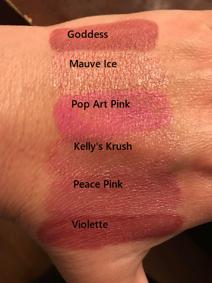
These tubes are the closest contenders in appearance while in the tube. Left to right: Goddess, Mauve Ice, Pop Art Pink, Kelly's Krush (retired), Peace Pink (retired) and Violette.

On the hand, they look different of course, but Pop Art Pink is still the brightest and the most matte.
The application was very even and smooth. Three coats in one direction gave perfect coverage. The color to me was pretty accurate of what I expected. It's a bubble gum pink color leaning more on the lavender side. The finish dries down very matte and the color applies evenly with no streaking or patching. It's not a color that I would find myself wearing because I lean more towards darker colors, but overall this is a pretty color and perfect for fans of brighter pinks and candy-toned colors.

 Mod Magenta was probably the color I was THE most excited about being that it is just up my alley. It's dark. It's rose-colored with a kick. Light colors don't traditionally look good on me, and I don't know that I can wear purple, navy and turquoise on a regular basis to work, so I ordered an extra one of this one to commission for myself. Before I got it, I envisioned a combination of Neutral meets Roseberry.
 Reality? I was wrong again. This one leaves Neutral in the dust. I don't think I have been THIS excited about a lip color in the entire time I've been a distributor, but this one, I'm keeping just for myself.

On my hand, definitely darker than the hotter pinks (Kiss For A Cause, Fuscia, Razzberry) and the pink-toned reds (Strawberry Shortcake and Plumeria). I love my Neutral, but Mod Magenta is so rich in pigment that Neutral in comparison looks, well, brown. I did not see that coming!

Edited: After this blog was published, I had a request to stripe it next to B. Ruby so here is an extra picture.

The application was very smooth and it is a beautiful ruby-colored reddish pink with no purple tones
 to it or shimmer. It dried very smooth and very matte. I didn't realize until this morning that the close-up of my lips shows a little streaking, so when I use this color the next time, I will possibly touch it up after the third coat dries with a little extra on the top lips, but it is a beautiful jewel color and I am so excited to be adding a color that I really love to my collection. It reminds me of ripe raspberries in summer.
  Lilac Lacquer, despite all the excitement I read on line about it, quite frankly just looks like a lighter version of Violet Volt. I've worn Violet Volt. I got great compliments on it since I matched my outfit and makeup to it although it really did give me the appearance of eating a grape Popsicle. So my initial thought? Violet Volt, but lighter. Lavender? Smooth? Okay.
 The reality: My expectation was dead-on accurate. If you like purples but Violet Volt is too intense of a purple shade, this is probably more up your alley. If you have Violet Volt and like a lighter one, this might be a good add for you. But if Violet Volt delivers all the purple goodness that you love and you don't want one lighter, this might be a tad of a waste. I didn't try layering Icicle over it, but I suspect that Violet Volt could be lightened with a coat of Icicle or a layer of Snow in between coats one and two. In other words, if Violet Volt is grape Kool Aid, Lilac Lacquer is a field of lavender.
 I did compare Lilac Lacquer to the other similar purples and also included Amethyst and Silver Violet ShadowSense for grins.

 In the below pictures, I am wearing Lilac Lacquer in the one with the headband and Violet Volt in the picture where I am fully made up.
 Application-wise, Lilac Lacquer is not the easiest. I could tell in the hand swatch that it was going to be a problem when I didn't get even coverage (see how Violet Volt streaks as well?) but it was even more so problematic on the lips. I did a full three coats with Lilac Lacquer and while it was fine on my lower lip, it was patchy and had some bald spots on my upper lip. I have no doubt I will wear this color again since I felt a little more comfortable wearing this than Violet Volt (although Violet Volt WAS fun), so what I will do next time is either apply four coats or touch up the bald spots on my upper lip after the second coat before applying a final four coat. A little extra drying time would have likely helped the patchiness as well. But it's a beautiful purple for the purple girls out there. Lavender without being pink or frosty. Purple without looking like you ate a grape slush and have stained lips. Very classy, matte finish and the perfect accent to a purple eye. I noticed that it definitely made my eyes look greener, which I tend to notice happens when I wear purple makeup.
 Skyline downright just freaks me out. I will concede that part of this is that I am soon to be 43 and turquoise is what I put on my eyes, not on my lips. The color is gorgeous, no doubt, I just don't know that I want to wear it on my lips unless I am going clubbing or dressing up like a Studio 54 wannabe from the late 1970s. But....that aside, let's give it a try.
The reality: Definitely NOT as shocking or crazy as I expected. It dried down to more of a dark blue turquoise, not the bright shocking Caribbean ocean blue turquoise I expected. I think with some great blended shadows, maybe some glitter, some dark turquoise liner, and bronzer and this could be a fantastic color for going out at night. I think this would also be an amazing color to layer with, and since you can use LipSense for face makeup, you could really create some amazing face art with it.
I lined it up next to Granite ShadowSense, Ocean EyeSense, T.E.A.M. Wicked, Denim ShadowSense and Light Sapphire ShadowSense which is a retired eye color.

And to show the comparisons? Skyline is definitely a richer blue than T.E.A.M. Wicked and has more green in it than Ocean EyeSense. There is no glitter or shimmer; it is a completely matte finish.

And the application ease was perfect. It applied very smooth, no streaking, no bald patches. The formula is very good.

 And lastly, Midnight Muse....my initial perception of this color was a matte version of T.E.A.M. Wicked minus the aqua sparkles. Too similar in shade to Blackberry. I'm not scared to try it on, especially since I rather like Wicked, but.....okay, let's see.
 The reality: Definitely not Blackberry. Definitely not T.E.A.M. Wicked. T.E.A.M. Wicked is more shimmery, glittery. This is matte navy blue. Smooth, blended blueberry puree. No purple, no eggplant, no black. Perfectly smooth application with no streaking, patching or unevenness. If you wanted a dark blue color, this is your color.
  I lined it up next to the blues and blacks of the
 SeneGence collection including Onyx ShadowSense and Blackberry. If you have longed for a blue lip color that resembles Denim ShadowSense, your wish has been granted.

 The application was very smooth. Three coats was a perfect application. It's a very striking color but I personally like it better than Blackberry because it has more depth to it without looking like you colored in your lips with a black Sharpie marker. I could see this looking totally bad ASS with a smoky eye and navy blue eyeliner and high-volume mascara. Ready to rock it out at a concert or an elegant night out with a dark blue dress? This is your color.
 So there you have it. There are the five colors of the Prism of Colors Collection. Cool, happening and different from anything right now that is carried by SeneGence. I currently have all five colors in stock and they are ready to be shipped out immediately. I am having a special in March with free shipping, so for $25, YOUR FAVORITE COLOR of this collection can be yours and in your hand in short order.
Make it a wonderful day and enjoy the rest of your weekend!
No comments:
Post a Comment